cherry
Why are websites for charities so bad?
Why are websites for charities so bad?
Industry Charity
Year 2025
Tools Figma, Framer
Category Website
Industry Charity
Year 2025
Tools Figma, Framer
Category Website


Overview
Overview
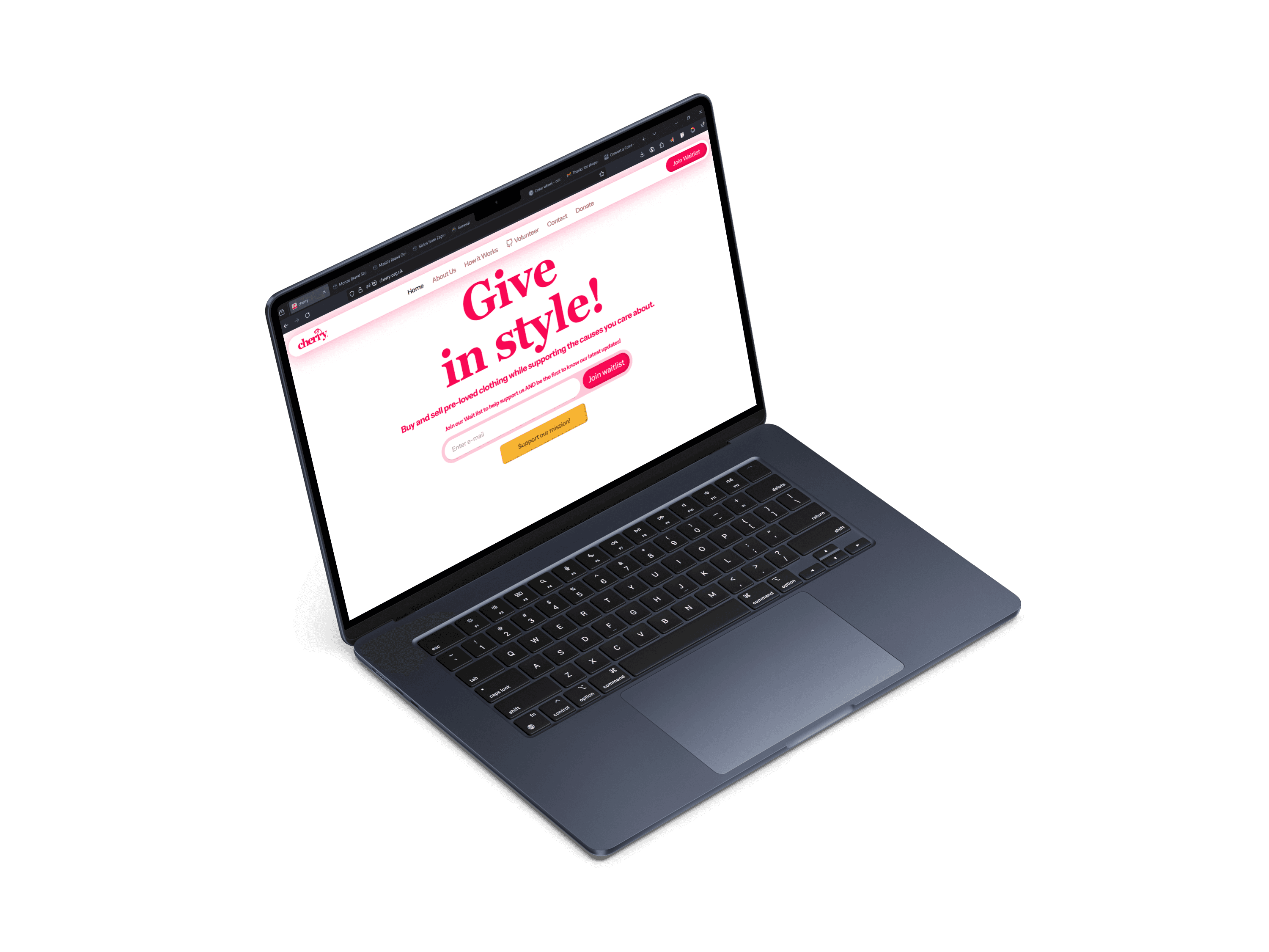
My first project at cherry was giving the charity a home on the internet. As a customer-to-customer platform combining sustainable fashion with charitable giving, Cherry sits in an unusual space, and its website needed to reflect that.
I started by looking at other charity websites, and most of them were bad. They buried the experience under information, tried to serve too many audiences at once (donors, people needing help, volunteers, partners, press, funders), designed desktop-first, and wrote copy with no feeling in it. That research became useful in an unexpected way: it was a clear list of everything Cherry shouldn't be.
Approach
Approach
Stakeholder conversations surfaced what mattered most: explaining what Cherry was, attracting volunteers and funders, being transparent about Cherry's mission and data handling, and giving people a place to donate with clarity and charm. They also wanted a live demo of the app's MVP embedded on the site.
I designed a platform that felt playful but still trustworthy, built around bold colour and copy with personality. Figma's prototype sharing tools let me embed the MVP demo directly into the site, and animation gave pages life instead of leaving them static. I designed and deployed the whole thing in Framer, which kept iteration fast and updates easy.
The result balances storytelling with conversion, inviting users to explore, sign up, and share.
The hardest part of the process was pushing back on stakeholders who wanted to add more. I kept the conversation anchored on one question: is this information important to the user right now? Anything that couldn't answer yes got cut.


Impact
Impact
Volunteer applications rose 80%
The site attracted interest from bid writers and funders
User satisfaction hit an all-time high
Volunteer applications rose 80%
The site attracted interest from bid writers and funders
User satisfaction hit an all-time high


Learnings
Learnings
This project taught me as much through friction as through success. After handover, stakeholders edited fonts, colours, sizes and styles across several pages, and some cards ended up cut off and unusable. Losing control of a design after it ships is frustrating, but it pushed me to get better at defending decisions: explaining the downstream cost of inconsistency, not just asserting a preference.
Going into later Cherry work, I took more ownership of the design system itself, and made a habit of giving rationale for every decision so the logic behind it was harder to unpick after I'd left the room. I'll be revisiting the website soon to fix what's drifted.
Other work for cherry

cherry
Digital rejuvenation of an app with a brand new way of making donation.
cherry
Digital rejuvenation of an app with a brand new way of making donation.

cherry
Redesigning the product card for clarity
cherry
Redesigning the product card for clarity



Al Attakora
I'm open to taking on new projects right now. Hit me up, let's talk and turn your business ideas into pragmatic yet delightful user experiences.
© 2025 AL ATTAKORA. All rights reserved.
Crafted with care
Al Attakora
I'm open to taking on new projects right now. Hit me up, let's talk and turn your business ideas into pragmatic yet delightful user experiences.
© 2025 AL ATTAKORA. All rights reserved.
Crafted with care
Al Attakora
I'm open to taking on new projects right now. Hit me up, let's talk and turn your business ideas into pragmatic yet delightful user experiences.
© 2025 AL ATTAKORA. All rights reserved.
Crafted with care